Revisiting COVID-19 Model Predictions from April
In April, I described a model used by the Institute for Health Metrics and Evaluation (IHME) at the University of Washington to predict the trajectory of COVID-19 deaths in Arizona. How good were those predictions?
The solid blue line in Figure 1 shows the predicted number of cumulative deaths for Arizona from the model on April 13, 2020. The red dots on the graph show the actual number of deaths through August 3, downloaded from the New York Times database on August 4, 2020.
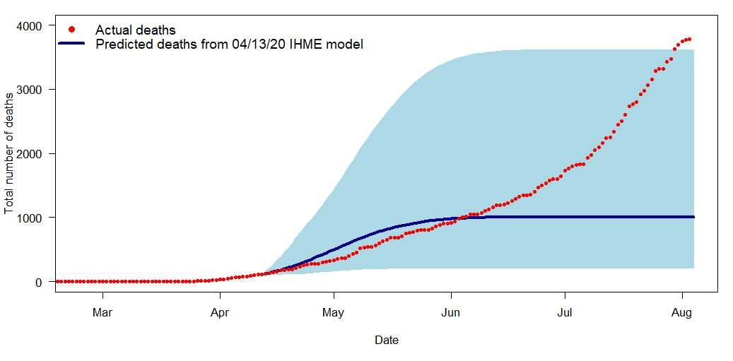
Figure 1. IHME model prediction (solid blue line) for Arizona on April 13, 2020, along with the 95% uncertainty intervals (light blue shaded area) for the predictions. The red dots show the actual number of cumulative reported deaths through August 3.
By the end of July, the actual cumulative number of deaths was outside of the 95% uncertainty bands (light blue shaded area) from the IHME model. The model projections clearly did not accurately describe the post-April-13 trajectory. In particular, the model indicated that the number of daily deaths would start decreasing after May 4, but the actual number of daily deaths has continued to increase.
What happened, and what does this say about statistical models for forecasting the disease outcomes?
First, let’s look at what a prediction model does. A statistical model for cumulative number of deaths fits a curve to describe the pattern of deaths observed to date, and then extrapolates to predict how many deaths will occur in the future. Because there are no data from the future, that extrapolation is based on assumptions about the pattern that will occur.
On April 13, Arizona was in the early stages of the pandemic and there was not much data from the state itself. The predictions for Arizona, therefore, depended almost entirely on the model assumptions and on patterns that had been observed in other locations. The April 13 model for Arizona had the following assumptions:
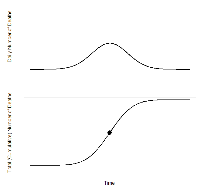
Figure 2. General shapes of curves in model used for Figure 1 for (a) daily number of new reported deaths and (b) cumulative number of deaths.
Arizona would implement social distancing strategies through the end of May, and after the end of May there would be a robust program of testing, contact tracing, and other measures to control the spread of the disease. The model predicted trajectories as a function of social distancing behavior; this assumption gives the inputs into the model for Arizona.
Arizona would follow the general pattern for deaths that had been observed in other locations. In April, when the model in Figure 1 was fit, daily deaths had begun to decrease only in Europe and Asia, and so the estimated curves depended heavily on patterns in those areas. The uncertainty intervals in Figure 1 were calculated from the variability among trajectories for other countries and states. This assumption says that a model estimated from data in other locations would apply to Arizona.
The curve for the number of daily deaths has the general shape of a normal distribution, shown in Figure 2a. This results in a curve for total (cumulative) number of cases (Figure 2b) that is symmetric about the dot in the middle (the inflection point). The blue line in Figure 1, giving the model prediction for total number of cases in Arizona, has the same form as Figure 2b. This assumption gives the general shape of the predicted curve.
If all of these assumptions had been met, then the blue line in Figure 1 would have been expected to describe the trajectory of the disease in Arizona. But that did not occur. Which assumptions were violated?
Let’s look at assumption 3 first. The model form in Figure 2 assumes that the number of daily deaths will decrease at the same rate that it had increased. That was a reasonable assumption in April, when few countries had started declining. In August, however, with more locations past the peak daily deaths, it appears that the decrease in number of daily deaths after the peak tends to be slower than the increase leading up to the peak.
As an example, let’s look at Italy, where daily deaths are now close to zero. The smoothed curve* fit to the number of daily deaths (Figure 3a) shows a rapid increase up to the peak near the end of March, followed by a gradual decrease. The curve in Figure 3a is not symmetric about the peak, and the curve for cumulative number of deaths in Figure 3b thus lacks Figure 2b’s symmetry about the inflection point.

Figure 3. (a) Daily deaths from COVID-19 in Italy, along with smoothed line. (b) Cumulative (total) deaths from COVID-19 in Italy, along with smoothed line.
But the longer right tail in Figure 3a only became evident later on. The smoothed curve in Figure 3a up to April 10 is consistent with the symmetric shape in Figure 2a.
We can see that Assumption 3, about the symmetric shape of the trajectory, is not supported by the data accrued for Italy after April (or for most other locations, either). But that assumption, that daily deaths would decrease after the peak at the same rate they increased before the peak, was not responsible for the prediction error in Figure 1 for Arizona.**
The poor predictions occurred because Assumptions 1 and 2 were not met in Arizona.
Arizona did not implement social distancing strategies through the end of May, as called for by Assumption 1. Some Arizonans social distanced, wore masks, and took other steps to slow the spread of the virus; others did not. The state allowed restaurants, food-serving bars, and other businesses to re-open on May 11 (nearly three weeks before the model had assumed), forcing employees of those businesses to return to work and allowing crowds to gather. In addition, tests for the virus were difficult to get in May and June, and even when a test could be obtained, it could take 10 or more days to learn the results.
The IHME model predicted the inflection point and the final height of the curve based on Assumption 2, that Arizona would follow a trajectory similar to other states and countries that implemented similar social distancing strategies. It is possible that even if the model predictions had been made under different social distancing assumptions, they might still have been a poor fit for the Arizona data because the general pattern in Arizona (and the United States more generally) might have differed from the pattern in parts of the world whose data had been used to estimate the model parameters.***
Models predict what would happen if the assumptions are met. The IHME model in April was clearly over-optimistic about the trajectory in Arizona. But little data existed at that point to use in developing a model, and there was no reason in mid-April for the modelers to anticipate that Arizona would re-open as early as it did.
As more data have accrued, the IHME researchers have been able to refine and improve the model. The new IHME model includes epidemiological features; as of August 4, the model for Arizona predicts an inflection point in early- to mid-August. Under what the modelers consider the most likely scenario, the model predicts a total of 7,946 deaths in Arizona (and about 231,000 in the entire U.S.) from COVID-19 on November 1. If Arizona continues to relax social distancing mandates at the current rate, the model predicts nearly 12,000 deaths on November 1.
As with the model from April, however, these model predictions depend on the assumptions made about future behavior. If conditions A, B, C, and D hold, the models say, and if the relationships between the model inputs and outcomes in other locations accurately reflect what would happen in Arizona, then we would expect to have Y deaths in Arizona on November 1. But these predictions do not have to become reality if Arizonans reduce the spread of the virus.
Copyright (c) 2020 Sharon L. Lohr
Footnotes
*I downloaded the data from the Italian Department of Civil Protection on August 2, 2020. June 24 in the data set had a value for cumulative deaths that was less than the value for June 23; I replaced the anomalous June 24 cumulative death value with the June 23 value so as to have a non-negative value for daily deaths on June 24.
For Figure 3, I used a smoothing spline to compute the curves (command “smooth.spline” in R with smoothing parameter 0.5).
**Assumption 3 predicts what will happen after the inflection point (time of peak daily deaths), but Arizona did not appear to have reached that point by the end of July. If the model had predicted the correct inflection point for Arizona, all of the predictions for Arizona up through August 1 would have been for the pre-inflection-point part of the curve, and the predicted form of the curve post-inflection would have been irrelevant. Rather, the problem was that the model predicted Arizona’s inflection point on May 1, which was much too early. Figure 1 shows that the earliest possible date for the inflection point in Arizona would be late July or early August.
***A note about correlation and causation here. The April 13 IHME model is based on associations seen in the locations that had data up to that point. Thus, the model estimated that, if all other things were equal, locations practicing social distancing had shallower curves than locations not practicing social distancing.
In this case, there are scientific reasons to believe causation plays a role. Social distancing is thought to reduce the spread of the disease, simply because you can’t become infected by a virus that you’re not exposed to. But there could have been other factors that occurred along with social distancing (for example, other government policies restricting crowds, or universal mask wearing, or a societal concern for one’s neighbor) that contributed to the differences. One cannot assume that implementing social distancing mandates alone will cause the trajectories to change in the ways the model predicts, because the changes might have been due to other behaviors or characteristics in the locations that mandated social distancing.
An additional assumption, not included in the list above, is that the statistics for number of daily deaths due to COVID-19 are accurate, or at least that they are counted the same way throughout the timeline. If, for example, COVID-19 deaths are more likely to be classified as due to another cause before August than after August, then the model prediction will be too low simply because the pre-August and post-August statistics are measuring different things.