AI vs. Undergraduate Statistics Students
I began teaching statistics at a time of intense debates about how to use technology (then rapidly changing) in the classroom. A small number of professors still insisted that students do all calculations with pencil and paper (just a few years earlier, one of my graduate school professors had assigned multivariate regressions to be done by hand — I suppose inverting 4x4 matrices gave me an appreciation for computers, but it added nothing to my understanding of linear models). Other professors allowed pocket calculators, but required students to use the formulas to calculate means and standard deviations instead of using the “standard deviation” button. Others argued that students should learn to use the latest developments in computing and integrated new technology into the classroom as soon as it was available.
I have always been in the last camp, and believe statistics teachers should use any technology that can develop students’ understanding and prepare them to do statistical work. Artificial intelligence (AI) tools are just an extension of earlier technological innovations affecting the practice of statistics. This technology, however, is able to carry out tasks that were previously thought to be doable only by humans. How to use it to augment students’ abilities — to develop their statistical problem-solving skills while freeing them from tedious tasks better suited for a machine?
To investigate what an AI can do, I gave Gemini three student activities I had used in the early 2010s for undergraduate classes in mathematical statistics and regression/design of experiments (DOE). Students used personal computers in both classes, but the technology at the time could not solve problems on its own like Gemini can. How did Gemini’s answers compare with those from my students? And what does this mean for teaching statistics?
Change-of-Variable Problem
The first problem submitted to Gemini was from an in-class exam in mathematical statistics. It was set up so students could do the integration on paper, but also required them to think about the region of integration.
Query: Let X and Y be independent random variables with pdf f(x) = 2x for 0 < x < 1. Let U = X and V = Y/X.
(a) What is the joint density of U and V?
(b) What is the marginal density of V?
Gemini responds: “The joint density of U and V can be found using the change of variables technique” and proceeds through the steps of (1) writing down the joint density of X and Y, (2) finding the inverse transformation and Jacobian, (3) finding the joint density of U and V along with its region of support, and (4) integrating the joint density f(u,v) with respect to u to find the marginal density of V.
Winner: Gemini. Gemini came back with the answer in less than two seconds, with a beautiful solution describing the steps in detail. I would have been happy to have Gemini’s answer from any of my students. To be sure, most of my students solved the problem correctly too (a few messed up the marginal density because they thought U and V were independent), but even the quickest student took more than 5 minutes. Gemini did not sketch the support of the joint density, as the students had been taught, but would have done so if explicitly asked.
This is a well-defined problem whose answer can be found by following the standard algorithm for change-of-variables. One would expect Gemini to do well with it.
A Linear Regression Analysis
The second problem involved analyzing a dataset using linear regression.
Query: In a special election for a state senate vacancy, Candidate A (Republican) received 19,691 votes on voting machines; candidate B (Democratic) received 19,127 votes on voting machines. On absentee ballots, however, candidate B received 1,396 votes and candidate A received 371 votes. Candidate B thus had more total votes than candidate A.
The data given in this spreadsheet are from 21 other state senate elections in the state. Are the number of absentee ballots for the Democratic candidate for the special election unusual relative to the patterns in the data from previous elections? The spreadsheet columns are
Year = election year
District = district number
Dem_absentee = number of absentee votes for Democratic candidate
Rep_absentee = number of absentee votes for Republican candidate
Dem_machine = number of voting machine votes for Democratic candidate
Rep_machine = number of voting machine votes for Republican candidate
Gemini’s first solution: Gemini is not as successful with this request as with the math stat problem. It does not consider the voting machine data at all, but instead performs a univariate analysis examining the number and proportion of absentee votes for the Democratic candidate for each election. Here is Gemini’s analysis of the proportion of absentee votes for the Democratic candidate:
Analysis of Democratic Absentee Proportion
Metric Historical Elections Special Election Assessment Democratic Absentee Proportion Mean: 64.53% 79.00% Higher than the average, but not the maximum. Historical Range (Min-Max) 32.66% to 86.49% 79.00% Not outside the historical range. Z-Score N/A 0.98 The proportion (79.00%) is about one standard deviation above the mean proportion (64.53%), suggesting it is higher than average but not an unusual pattern. The Democratic candidate in the special election received 1,396 of the 1,767 total absentee votes, resulting in a 79.00% share. This proportion is high, but the historical data shows that Democratic candidates have achieved up to 86.49% of the absentee vote, and the 79.00% is well within one standard deviation of the historical mean proportion.
In summary, while the Democratic candidate did very well with the absentee ballots (receiving more than the historical average and a high proportion of the total), the results are not statistically unusual compared to the patterns observed in the previous 21 elections.
Gemini calculates the z-score of the contested election, using the standard deviation of the proportion of Democratic votes from the historical data, and concludes that the contested election is not unusual. My students, by contrast, immediately recognized that they needed to see whether the absentee votes for the Democratic candidate in the special election was an outlier relative to the relationship between absentee and machine voting in the historical elections. Many of them looked at the relationship between the absentee vote difference and the machine vote difference. Gemini did that, too, when I gave it a more specific follow-up query.
Follow-up Query: Develop a regression model predicting diff_abs (= Dem_absentee - Rep_absentee) from diff_machine (= Dem_machine -Rep_machine). Using a prediction interval, how well does your model predict the contested election?
With this query, Gemini writes python code to calculate the regression coefficients (diff_abs = −125.90 + 0.0127 x diff_machine) and prediction interval, and concludes: “The model's prediction for the special election is significantly lower than the actual observed result, indicating that the Democratic candidate's absentee ballot performance in the contested election was unusual relative to the historical pattern.”
I did not specify the type of model in my query, and Gemini assumes a straight-line model is meant. Gemini does not assess the validity of this model or produce a scatterplot of the data, which is the first step in any regression analysis. So I made another query:
Query: Create a scatterplot of diff_abs vs diff_machine and show the contested election on the plot.
Gemini then created the very nice scatterplot shown in Figure 1.
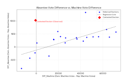
Figure 1. Gemini’s graph of the difference in absentee votes vs. the difference in machine votes for the historical elections, with the contested election indicated by the red diamond.
A straight-line regression relating the two vote differences is just one of the possible analyses of these data. Most of the students fit this model as part of their analysis, but they also graphed the data, performed model diagnostics, and identified inadequacies of the model fit. Students looking at the difference model also fit a quadratic regression, which fit the data better, and they noted that the contested election is an outlier in both the straight-line and quadratic regression models.
Most students also fit a model predicting the proportion of absentee votes for the Democratic candidate as the dependent variable and proportion of machine votes for the Democratic candidate as the independent variable. Gemini does this, too, when requested.
Query: Fit a regression model with proportion of absentee votes for the Democratic candidate as the dependent variable and proportion of machine votes for the Democratic candidate as the independent variable, using the historical election data. Is the contested election an outlier?
Gemini fits the model as requested, notes that this model is a better fit than the model for vote differences in Figure 1, and concludes that the contested election is a massive outlier. And for this analysis, it does the scatterplot (Figure 2) without being specifically asked for it — Gemini appears to be learning what I want to see! Gemini says: “As shown in the scatterplot, while all historical elections follow a relatively tight linear trend (where absentee performance mirrors machine performance), the contested election (red diamond) sits far above the expected trend line. This indicates that the Democratic candidate's performance in the absentee ballots was fundamentally inconsistent with their performance on the voting machines and the historical patterns.”
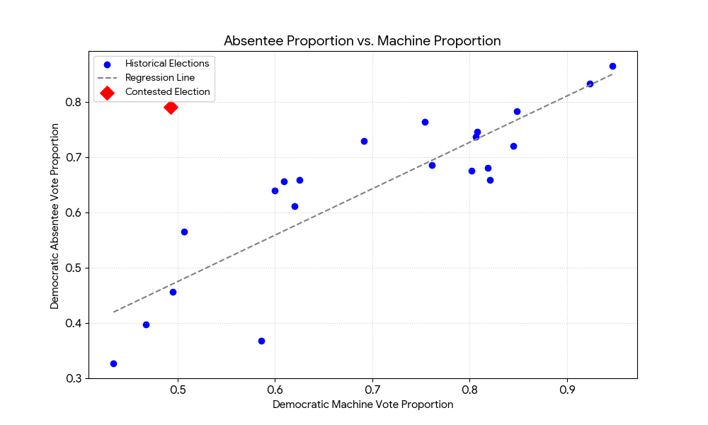
Figure 2. Gemini’s graph of the proportion of absentee votes going to the Democratic candidate vs. the proportion of machine votes going to the Democratic candidate, with the contested election indicated by the red diamond.
Winner: Close, but students have an edge. With the original open-ended request, Gemini ignored the bivariate structure of the data and simply looked at the absentee votes. In the univariate analysis, the contested election is not unusual at all. The election is unusual when the bivariate pattern is considered, but Gemini’s regression analysis is not as thorough as that of the students. Gemini does the tasks I ask, but does not graph the data for the first model without an explicit request, and does not consider whether the model is appropriate. It also does not look at alternative regression models, as my students did, until I ask it to.
Of course, one can argue that Gemini’s shortcomings are my fault since my initial instructions were vague. But a big part of analyzing data is deciding what analyses to perform. My students could do that — some of their models were more appropriate than others, but their analyses reflected the diversity of approaches that could be taken to examine these data (and the contested election is an outlier for all of the regression models they considered). Gemini’s initial approach, when given an open-ended question, ignored the voting machine data. On the other hand, Gemini appeared to learn what I wanted to see in a regression analysis as it fit more models. When it fit the model to the proportion data, it provided the scatterplot and assessed how well the model fit the data without being asked.
Critiquing an Experiment
Part of developing statistical thinking is being able to critique studies that use statistics, and each semester my regression/DOE students critiqued a journal article as one of their projects. Sometimes everyone in the class critiqued an article that I found; in other years I would ask each student to find a medical article on a subject of interest and critique the experimental design and statistical analysis in that article.
Query: Read the material on Experiment 1 in the paper by Schnall et al. (2008). Write a critique of the statistical methods used for Experiment 1, including a discussion of the research design, criteria for inclusion or exclusion in study, the analysis methods, the display of the results, and model diagnostics. Discuss the validity of the authors' conclusions. What could they have done to improve the design or analysis of this experiment?
Experiment 1 recruited Stanford students who were passing by the experiment location to participate in an investigation of whether exposure to an unpleasant odor would affect the severity of students’ moral judgments. The students were randomly assigned to one of three experimental conditions, with 40 students in each. The conditions were identical except for the amount of “fart spray” (ammonium sulfide, which releases hydrogen sulfide, a component of flatulence, when sprayed) applied to a bag lining a trash bucket about 6 feet from the participant: none for Condition 1 (control), four sprays for Condition 2 (mild stink), and eight sprays for condition 3 (strong stink). Then students were then asked to rate each of four vignettes on a scale from 1 (not at all disgusted) to 7 (extremely disgusted). The vignettes involved: (1) legalization of marriage between first cousins, (2) sex between first cousins, (3) driving vs walking to work, and (4) a “studio’s decision to release a morally controversial film” in which some interviewees were unaware they were being filmed.
My 20-year-old students loved this assignment and turned in critiques that were perceptive, creative, and very funny. They recognized the excellence of the design and analysis of this experiment: the authors used well-defined criteria for inclusion into the study, randomized the students to the three experimental conditions, and analyzed the data appropriately.
The students mentioned several ways in which the experiment could be extended and improved, however. Most of the students in the class noted that while the recruited students consisted of both men and women, the authors did not analyze results by gender. The students wanted to know whether the relationship between odor exposure and disgust differed by gender, and most of them suggested that either the collected data should be analyzed by gender, or (better) that a future study should randomize men and women separately to the three conditions.
The students also highlighted the limited applicability of the experimental results. The experiment was performed on Stanford students (a conveniently available population, since one of the co-authors was a professor at Stanford). But would students at Arizona State University have the same reactions? What about non-students of the same age? Or middle-aged adults? The students said that the experiment should be replicated in other populations to apply more generally. Students also raised questions about the choice of vignettes and the labeling of disapproval as “moral judgment.” Several students suggested that it might be desirable to add a “control” vignette that was morally neutral.
Gemini did not raise any of these points. Its criticisms were pedantic and unfounded. Here is part of Gemini’s answer:
Component Description/Procedure Critique Analysis Methods The primary analysis likely involved a one-way Analysis of Variance (ANOVA) comparing the mean composite moral judgment scores across the three odor conditions (Control, Mild, Strong). Major Weakness: The published text fails to explicitly report the full inferential statistics (e.g., F-value, degrees of freedom, and p-value) for the main effect of condition in Experiment 1. This omission violates basic standards of transparency and replicability in scientific reporting. Composite Dependent Variable (DV) Moral judgments were a composite score based on responses to four vignettes (two disgust-related: Marriage, Sex; two non-disgust-related: Driving, Film). Area for Improvement: While the authors later conclude the effect is similar for both types of vignettes, they should first statistically justify combining these items into a single score (e.g., by reporting Cronbach’s alpha to demonstrate internal reliability) or conducting a mixed-model ANOVA (Condition x Vignette Type) to formally test the null hypothesis of no interaction, which is necessary to support the breadth of their conclusion. Display of Results The results for Experiment 1 are only described verbally in the text ("disgust can increase the severity of moral judgments relative to controls"). Major Weakness: The published snippet does not include a figure or table clearly displaying the descriptive statistics (Means and Standard Deviations) for the four moral judgment items or the composite score for each of the three conditions. This prevents a critical evaluation of the magnitude and direction of the effect.
Gemini is wrong about all three items. It says that the study failed to “explicity report the full inferential statistics,” but Schnall et al. (2008) give all of this information in the sentence “Self-reported disgust varied significantly as a function of condition, F(2, 117) = 13.69, p < .001” on p. 1098. For its second criticism, Gemini apparently missed that the authors performed a two-way ANOVA to examine whether there was an interaction between vignette disgust level and condition. The third criticism is wrong, too, since Schnall et al. (2008) provided a table of means and standard deviations on p. 1099 of the article. The only valid part of Gemini’s critique is its praise of the use of randomization. Gemini does not mention how the experiment might be extended, or provide suggestions about further research. Gemini would have received a poor grade on this assignment.
Winner: Students, by a large margin. My students identified creative ways to build on this experiment and questioned whether expressing disgust at the vignettes is measuring moral judgment. And their reports were immensely entertaining to read as well as educational (I had not previously seen some of the students’ euphemisms for breaking wind).
Using Gemini in the Classroom (In March 2026)
Gemini excelled at carrying out well-defined tasks. It solved the change-of-variable problem in seconds, and it carried out the regression analyses exactly as requested. When presented with a vaguer request about whether the contested election was unusual, however, Gemini showed a notable lack of imagination. It performed a univariate analysis when clearly a bivariate analysis was called for; when asked to perform a straight-line regression, it did not evaluate the appropriateness of the model. For the third task, Gemini’s pettifogging critique of the one-way ANOVA experiment in Schnall et al. (2008) had multiple errors and neglected the main areas where improvements could be made.
Kim (2026) discusses three paths that statistics teachers can take in the AI era: (1) Stick to current curricula, (2) Reshape statistics programs to be more like computer science, (3) Create a distinct niche for statisticians that draws on their unique abilities. He clearly favors the third path. I agree, and think judicious use of AI in the classroom can help in creating this distinct niche. It can also help in developing statistical understanding in students who do not intend to become statisticians.
Statistics students still need to learn statistical theory and the principles of statistical analysis, but AI systems such as Gemini can reduce the amount of time they need to spend on routine calculations and programming. In the regression/DOE course I taught in the early 2010s, students brought their laptops to class and worked in small groups on various data analysis and experimental design problems, while I circulated around the room answering questions and nudging them when they got stuck. With AI tools, students would need much less time performing the mechanics of the data analysis, and more class time could be spent on the higher-order problems of what model should be used, exploring alternative models, and interpreting the results.
AI tools can free students in an introductory statistics course for non-majors from tedious calculations, so they can spend more time learning to be thoughtful consumers of statistics. Many introductory statistics textbooks still have pages and pages of exercises asking students to calculate five-number summaries or t confidence intervals for a small set of numbers. Would it not be better to have students learn how to use an AI system to do these routine tasks, and instead develop skills on how to interpret statistics and judge their quality?
What AI systems cannot replace (at least right now) is critical statistical thinking. Just as the use of electronic computers in the 1960s freed statisticians to use more complex models, handle larger datasets, and develop new methods for extracting information from the data, AI systems can free statisticians from routine programming and facilitate the development of new statistical tools. But would an AI system have been able to invent the jackknife and bootstrap?
Gertrude Cox, one of the most influential statisticians of the 20th century, became interested in statistics when her calculus professor asked her to work as a “computer” in the Mathematical Statistics Service Center at Iowa State University (see Lohr, 2019). In the 1920s (and through the 1950s), a “computer” was a person who performed calculations on hand-operated adding machines. Calculations for linear regression models with many explanatory variables could take weeks and an error at any point could result in incorrect coefficients. After founding the Department of Experimental Statistics at North Carolina State College in 1941, one of Cox’s first activities was to establish a computing laboratory. In 1956, her department became one of the first in the country to acquire an IBM computer, and Cox advocated for worldwide adoption of the latest technology for statistical education (perhaps because of the many hours she spent as a human computer). To Cox, new technology was not a threat but an opportunity for statisticians. The same is true for AI today.
Copyright (c) 2026 Sharon L. Lohr
References
Kim, J.-K. (2026). Statistics in the Age of AI. Amstat News (February issue), 33-35.
Lohr, S. (2019). Gertrude M. Cox and statistical design. Notices of the American Mathematical Society, 66, 317-323.
Schnall, S., Haidt, J., Clore, G.L., and Jordan, A.H. (2008). Disgust as Embodied Moral Judgment. Personality and Social Psychology Bulletin, 34, 1096-1109, available at https://pmc.ncbi.nlm.nih.gov/articles/PMC2562923/.