CDC Wastewater Viral Activity Level Maps: Why Are They Bluer?
My favorite statistical podcast is actually about virology. The hosts of This Week in Virology (TWiV) are superb data communicators, and they often highlight statistical virtues or shortcomings of the virology and infectious disease papers they discuss.
In TWiV Clinical Update 1352, recorded on August 26, 2026, Dr. Daniel Griffin used a statistical term that was new to me, saying that the Centers for Disease Control and Prevention (CDC) had “bluewashed” COVID-19 heat maps. Heat maps indicate activity level by color; a common map palette moves from blue (low level) through green and yellow to red (high level). The CDC changed the categories in the SARS-CoV-2 Wastewater Viral Activity Level Map in August 2026 (see Table 1). Some of the states that would have been in the “Moderate” category according to the previous classification are now in the “Low” category, and some of the states that would have previously been in the “Low” category are now classified as “Very Low.” With the new classification, states were shifted from redder colors toward the blue end in the map: Dr. Griffin called this shift bluewashing.
| Category | 2024 Levels | 2026 Levels |
|---|---|---|
| Minimal / Very Low | Up to 1.5 | Up to 2.6 |
| Low | 1.5 to 3 | 2.6 to 4.9 |
| Moderate | 3 to 4.5 | 4.9 to 7.9 |
| High | 4.5 to 8 | 7.9 to 11.6 |
| Very High | Greater than 8 | Greater than 11.6 |
* December 2024 levels are from https://restoredcdc.org/www.cdc.gov/nwss/rv/COVID19-currentlevels.html; August 2026 levels are from https://www.cdc.gov/wastewater/about/wval.html. The first category was called "Minimal" in 2024 and "Very Low" in 2026.
Let’s look at the effect of the category change on state classification, and then explore why, statistically, the new method used to calculate categories could have led to the shift. The map in Figure 1, downloaded from https://www.cdc.gov/wastewater/respiratory-viruses/national.html on August 29, 2026, displays the COVID-19 wastewater viral activity levels calculated using the 2026 thresholds (third column of Table 1). Figure 2 shows the heat map calculated with the same data but with the map categories determined using the 2024 thresholds (second column of Table 1).¹
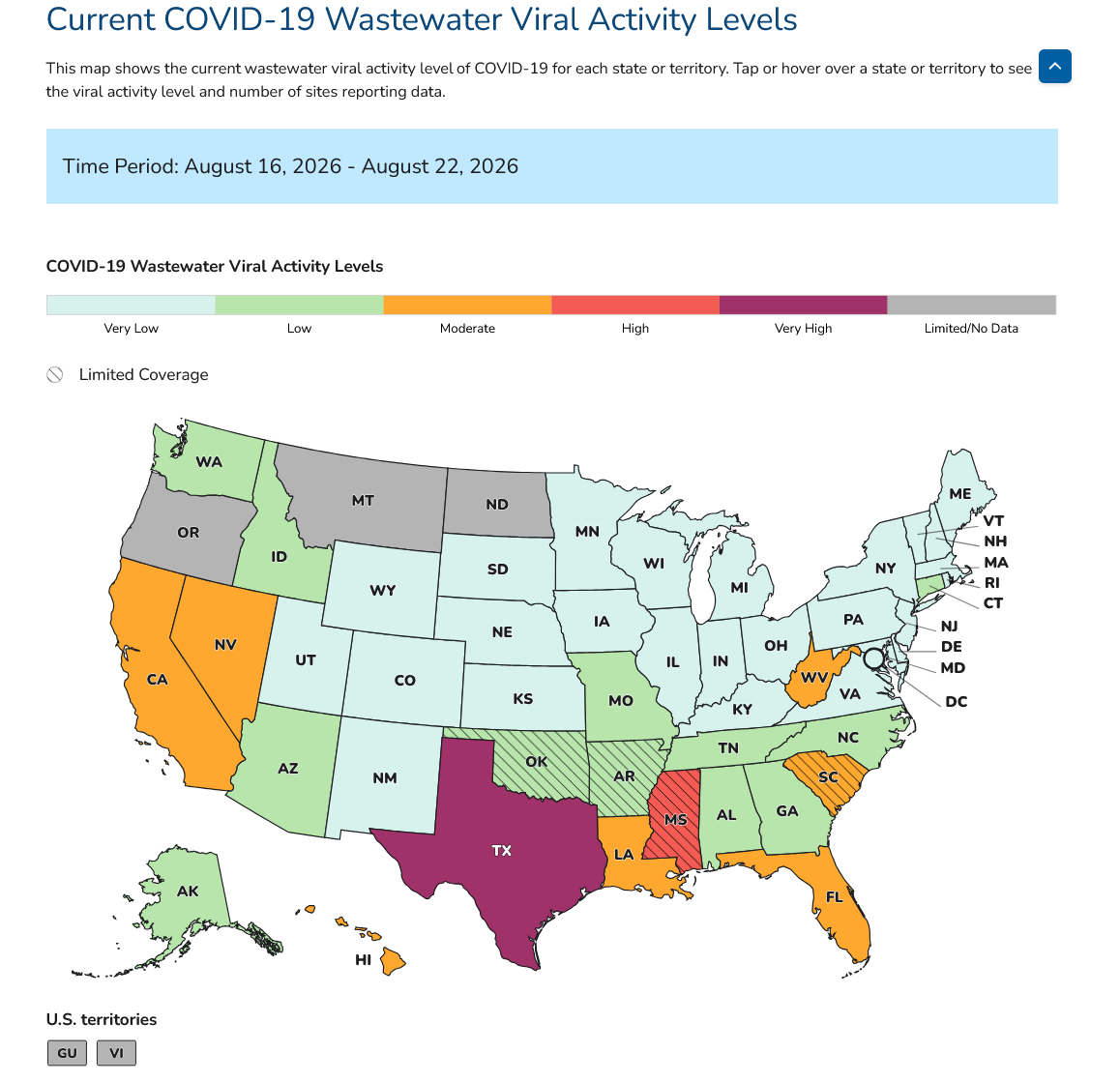
Figure 1. COVID-19 Wastewater Viral Activity Levels, August 16-22, 2026. This map was downloaded from https://www.cdc.gov/wastewater/respiratory-viruses/national.html on August 29, 2026. The CDC constructed this map using the August 2026 classification of states.
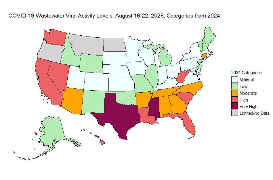
Figure 2. COVID-19 wastewater viral activity levels, using the category levels from December 2024. I constructed this map using the data from the “Download NWSSWVALStateMap (CSV)” link in https://www.cdc.gov/wastewater/respiratory-viruses/national.html, downloaded August 29, 2026.
Figures 1 and 2 show that twenty-five states move to a different category when the 2024 classification is used. Nine states shift from “Very Low” to “Low,” seven from “Low” to “Moderate, seven from “Moderate” to “High”, and one from “High” to “Very High.” The state of Washington, with a value of 4.84, moves two levels from “Low” all the way to “High.”
What Changed in the Methodology?
The methodology updates describing the change in categories can be found at https://www.cdc.gov/wastewater/about/wval.html. The WVAL Thresholds section says: “Previously, WVAL thresholds for influenza A and RSV were calculated using Jenks Natural Breaks, whereas thresholds for COVID-19 were calculated using percentiles. As of August 2026, WVAL thresholds were re-evaluated using Jenks Natural Breaks applied to the most recent 24 months of data for influenza A, COVID-19, and RSV.”
Jenks Natural Breaks method is, essentially, a one-dimensional special case of k-means clustering, an algorithm used to group multidimensional data points into classes that are as homogeneous as possible. Many metrics can be used to assess homogeneity, but often the classes are formed so as to minimize the within sum of squares (SSW):
where c is the average of the data values in class c.
You can see from the SSW formula why this is called a “natural breaks” method. Suppose the data have large natural breaks. For instance, if C = 3 and the data values are
1 2 3 4 7 8 12 13 14 15 16,
the algorithm will set the class boundaries at the natural breaks of 5.5 and 10 since these boundaries minimize the SSW.
But minimizing the SSW has an additional effect when data follow a skewed distribution, as would be expected for quantities such as pollutants or viral activity levels. Data points from the tail of a skewed distribution tend to be more dispersed than data points closer to the mode. An algorithm that minimizes the SSW will thus put fewer points in the higher (red) categories than in the lower (blue and green) categories.
Figure 3 illustrates the difference between using percentiles and using a k-means (Jenks) algorithm to form categories. For the dataset in the first two rows with 50 equally spaced data values, the percentile method (here, dividing the data at the 20th, 40th, 60th, and 80th percentiles) and the k-means algorithm give the same classes, with 10 data points in each class. The two methods give different categorizations for the skewed data (generated using exponential distribution percentiles) in the third and fourth rows. The percentile method again places 20 percent of the data (10 data points) in each class. The k-means algorithm minimizes the SSW by placing fewer points in the higher classes where there is more variability. The top class for the k-means algorithm has only 3 data points and the next highest class has 6 data points, while the lowest class contains 19 data points. All of the cutpoints for the k-means algorithm with skewed data are to the right of the corresponding cutpoints for the percentile method.²
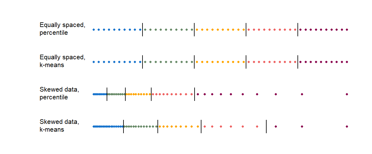
Figure 3. Class boundaries for equally spaced and skewed data, using percentile and k-means methods. The vertical bars indicate the class boundaries.
This is the same pattern we see in Table 1 and in Figures 1 and 2. Changing to the Jenks Natural Breaks (k-means) method from percentile breaks has resulted in fewer states being placed in high-risk categories. The methodology update at https://www.cdc.gov/wastewater/about/wval.html says that “Threshold performance was assessed by comparing WVAL thresholds with National Syndromic Surveillance Program categories” but does not explain why the classes resulting from minimizing the within sum of squares correspond to “Very Low,” “Low,” “Moderate,” “High,” and “Very High” risk levels or why the new numerical ranges for these categories are so very different from the ranges used previously.
One consequence of the August 2026 scale change is that the time series for COVID-19 wastewater viral activity maps has been broken. One cannot compare maps from August 2026 and later with archived maps from earlier time periods because the numerical ranges for the categories have changed. However, the data sets with the numerical values for each state are still being published. Researchers who prefer the previous classification or a different scale could draw their own maps to compare activity levels over time (and are welcome to adapt my R code used to create the map in Figure 2).
The percentile and k-means methods both “grade on the curve.”³ This ensures that the full color range is used in a map of the data set used to determine the categories (for Figure 1, the previous 24 months of data). But for the purposes of “comparing wastewater data within and across sites” and using “these data to make informed decisions on how to protect yourself and others from respiratory viruses,” fixed categories that correspond to scientifically-defined risk levels would be more helpful. This is what is done for the UV index on your weather app or map, where green always means low UV exposure with little sun protection needed, and red and purple always mean high UV exposure indicating a need for protective clothing or sunscreen. If a fixed-category viral activity map became bluer over time, it would be because wastewater virus levels had ebbed, not because the map scale changed.
Copyright (2026) Sharon L. Lohr
Footnotes and References
¹The site https://data.wastewaterscan.org/about/#18 requests that the following statement be included when the wastewater data are used: “These data were collected as part of the WastewaterSCAN / SCAN project, a partnership between Stanford University, Emory University, and Verily funded philanthropically through a gift to Stanford University.” Boehm et al. (2026) describe the data collection.
For discussion of how wastewater data are used in public health surveillance, see Chapter 5 of National Academies of Sciences, Engineering, and Medicine (2024), https://www.wastewaterscan.org/, and https://www.cdc.gov/wastewater/about/wval.html. Dr. Griffin discusses research on the relationship between wastewater measurements and disease levels in TWiV 1032 (August 5, 2023), starting at about minute 8:10. Alhassan et al. (2026) compare statistical models for forecasting COVID-19 from wastewater data.
²The k-means method is highly sensitive to outliers. If you add a data point that is twice the maximum value to either dataset in Figure 3, the k-means algorithm will put that point in a class by itself, because that makes the within-class sum of squares equal to zero for the class containing the outlier and minimizes the SSW.
For past graphs, the CDC removed outliers with a z-score > 4; as of August 2026, the CDC winsorizes them to the 99th percentile. Winsorizing rather than removing outliers can also shift the class cutpoints upward (for both percentile and k-means methods) because the winsorized data contain more points at the upper end.
If you transform the data, say by taking logarithms, the cutpoints for the percentile method remain in the same positions but the cutpoints change for the k-means method.
³I never graded on the curve when teaching. Instead, I had a set of learning objectives for each class, and graded students according to how well they met these standards. If all students showed that they understood the statistical concepts and were able to apply them — which, after all, was my goal as a teacher — then all students would receive an A.
Alhassan, F., Karami, H., Bleichrodt, A., Hyman, J. M., Fung, I. C., Luo, R., and Chowell, G. (2026). COVID-19 forecasting from US wastewater surveillance data: A retrospective multi-model study (2022–2024). Journal of Theoretical Biology, 112449, https://doi.org/10.1016/j.jtbi.2026.112449.
Boehm, A. B., Wolfe, M. K., A. L. Bidwell, A. L., Zulli, A., White, B. J., Shelden, B., and Duong, D. (2026). Pathogen nucleic acids data in wastewater solids from 147 treatment plants in the United States: 2024-2025. Data in Brief. 46, https://doi.org/10.1016/j.dib.2026.112503.
National Academies of Sciences, Engineering, and Medicine (2024). Increasing the Utility of Wastewater-based Disease Surveillance for Public Health Action: A Phase 2 Report. Washington, DC: The National Academies Press.